
Think about the main purpose of your website - supporting the enrollment of international students from many different backgrounds. With universities focused on diversity, it's important to have as many students as possible be able to access your website. This would include students with a disability; whether this is permanent, temporary, or socio-economic.
In the UK 21.5% of the population identify as having a permanent disability. Combine this with members of the population who don’t identify as being disabled, those who are restricted by their socio-economic situation, or someone with a temporary disability, and the percentage will be far higher.
A temporary disability can be anything from a hangover to an arm in a sling (meaning that normal mouse/keyboard function is rendered useless) and includes things the majority of users are affected by, such as using a phone in bright sunlight.
Here are five simple tips for making your website more accessible. By working on these areas of your site, you will ensure that your website can easily be accessed by as many users as possible. More importantly, it’s the right thing to do.
1. Make your copy as easy to read as possible
While flowing prose and academic writing are great for university assignments, these styles of writing are not the best for the web. English is a second language for most international students, and dyslexia affects around 1 in 10 people - it's the most common language-based learning disability.
One of the easiest things you can do to ensure your website is easy to use is to get a professional digital writer to create your written content. From link text to your chancellor's welcoming statement; keep your written content clear and concise.
The w3C (the organization that upholds website standards) has compared overly complex copy to an easy-to-read version.
2. Alternate text for images
Some users will access your website using a screen reader. A screenreader is a piece of software that reads out a website to a user.
Text is an obvious component of a site that is read by a screenreader, but images also need to be read: an image’s alt text (alternative text) should describe the image as specifically as possible while not being too long.
With alt text in place, a user of a screenreader can know the visual elements that are on the page too, giving a more complete representation of the content on your site. Every image on your site should have alt text. If you’re not sure where to start, then Mozilla has an excellent guide for writing good alt text.
3. Use accessible colors with good contrast
Choosing the right color for the text on your website may seem like a simple design choice but it can make a big difference to users. For example, If you have text in a light grey on a white background, this will make the text hard to read for someone with a visual impairment.
It will also make it difficult for someone with regular vision to read on an older device screen or on a phone in bright sunlight. The awesome tool Who Can Use it lets you check the contrast of two colors and gives detailed information about if your colors have good contrast. For a Studee color example the “Studee” purple and white is used as this is a common combination on the site.
4. Make your website faster
Improving the speed of your website may not seem like an obvious choice for improving accessibility, but it will increase conversion and visitor satisfaction for all users; Google very much agrees. Unfortunately, there is no magic trick for speeding up your website, and it can take a lot of time involving laborious tasks.
The simplest thing you can do is to optimize your images. An image file comes with extra information your users won’t need made up of data about the photo. Collectively, this extra information slows down your site. At Studee, to get rid of this extra and unnecessary data we use a tool called Kraken.io which will optimize your images ready for you to use on your site. This basic web tool is free to use, you simply upload a folder or drag and drop your images onto the app.
You have a choice of compressions; Lossy, Lossless, or Expert. Lossy will result in the picture quality being reduced but most of the time it’s very hard to notice, whereas Lossless won’t affect the image quality. I would recommend starting with Lossy and if it doesn’t look good then just use Lossless compression. The balance you are striking is quality and file size vs load time. By reducing the visual quality of an image slightly you can dramatically reduce the amount of time it takes to load.
The other important thing to do with images is to make sure they are the correct size. If you’re uploading a profile picture of yourself that will only ever be used as a small image on the website, don’t upload a really large image. For example, Studee has a profile picture for our testimonial referees that is only ever 88px wide by 88px high.
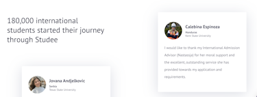 Studee testimonials
Therefore, we upload the picture at 88px by 88px. If we upload it at say 352px by 352px the image would be three times too large and take longer to load.
5. Make every interactive element keyboard accessible
“All functionality of the content is operable through a keyboard interface” - this is a basic accessibility requirement but one often forgotten about. It means that anything you can do with a mouse or touchpad must also be possible to do using a keyboard.
Alongside this, it is essential to have a consistent keyboard focus style. When using a keyboard in lieu of a mouse, it must be visually obvious when you are interacting with something on the page. Mouse users often have hover effects; when you hover over an interactive element something happens and this needs to also be the case with a keyboard. By default, browsers will add an outline to interactive elements - in Google Chrome this is a blue outline as you can see in the screenshot (around the Studee logo).
For more information about focus style, check out this article from accessibility consultants Deque.
Additionally, read this guide on how to check if your website has good keyboard focus styles. If you can easily work out where the focus is then that’s fine, but if not then this is something you’ll want to address. As you’ll see, it’s basically impossible to work out what's going on if you’re only using a keyboard and there isn't any focus style. It’s similar to fumbling around in the dark trying to find a light switch.
Accessibility isn’t easy. As the accessibility expert Leonie Watson said; web accessibility isn’t about being perfect, just a little bit better than yesterday.
Our website attracts thousands of visitors daily. That's thousands of potential student leads for our partner universities.
We'd love to start matching these pupils to your entry criteria, and supporting them throughout the admissions process.
